Stunning Living Room
Okay, so I don’t very often look at pictures and say to myself, “That’s it. That’s the room I want.”
But I did when I saw these pictures.
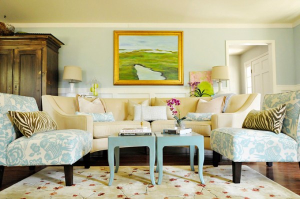
Wow. I love this room. It’s done in my colors! The ONLY thing I would change would be to swap in the rug from this room.
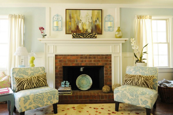
I love that this room was created by the homeowner, and photographed by her as well. Somehow I like rooms better when they’re created by the people who live in them. I love the work of designers, too, but I always wonder if people really live in those spaces. You can find Julia’s blog here . The room was featured on House of Turquoise , which is where I saw it.
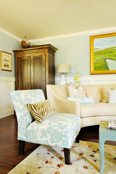
My favorite elements in the room, aside from the all the blue and white on the walls, are the chairs and the painting. Julia painted that gorgeous piece. And while I’m not usually a fan of gold, I’d hang that beauty in my house in a heartbeat. Stunning.
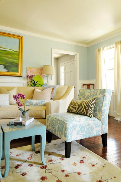
The chairs are on my wish list. I’ve loved this aviary print for a long time. Chances are I’ll never see them in person because they’re low on the priority list, but still they’re beautiful. I was surprised by this, but I actually like the zerbra print pillows. I’ve NEVER like animal prints, but these pair really well with the chairs and add a nice touch to the room. Once again, there’s not too much clutter in the room so it’s easy on the eye.
It’s all so beautiful. I suppose it’s a good thing that my living room doesn’t look like this. I’d never leave it, which would be a very sad thing for our bathrooms. Truthfully, I don’t share these pictures because I’m unhappy with my own house or because I’m wishing mine was like this. My floor plan is different, and our family’s needs are different. My home is full of children running and bumping and spilling. I refuse to let the house be more important than the people, so I do some things my own way in order to reduce stress. For instance, I could never put an orchid on a coffee table. It would be spilled, broken, eaten by someone before I could take a single picture (remember George?) . And that’s life.
I share them because lately I’ve been really motivated by pictures like these. They’re helping me decide what I want to do with my own house, and I’m taking those ideas and putting them to work with items I already own. It’s a really fun creative experience for me, and I feel urgent about doing it before the warm season pulls us outdoors. The before and after pictures of this particular room are also a great reminder that a good eye and paint can go a long way.
Lastly, here is her entry. We don’t have an entry in our house, or at least we don’t have a wall in the entry for the eye to rest on. Ours opens up to three rooms and a hallway. I really like the way she’s made this entry both beautiful and functional. That basket beneath the console table holds her scarves. What a great idea. I also like the bird print to the left of the mirror.
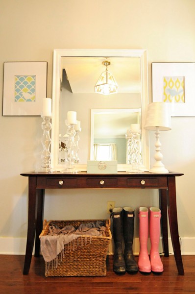
It’s always fun to see the creativity and vision that people have. I love it. Now I’m off to hang a piece in the girls’ room . I want to get it finished and move on to the boys’ room ASAP.
All photos in this post are from Pawley’s Island Posh via House of Turquoise.
Hope your day is great!
Hopeful Homemaker

agreed, a lovely room. It looks like you. I can see this room or something similar in your house when your kiddos are all a bit older. It’s really nice and restful looking. Although every time I leave your house I come home feeling like I want to make mine look just like yours. Emma asked me the other day when we were going to stay in the ‘cousins guest place’! E
FABulous room! I’m heading over to Julia’s blog to see more!