I am inspired
We have lived in our home for 3.5 years now, and in that time I’ve started to pull together the childrens’ bedrooms several times, only to stop because I’m really not sure exactly what I want them to look like.
Until now.
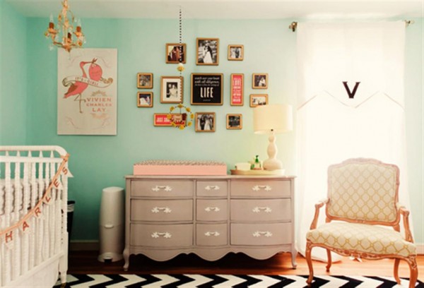
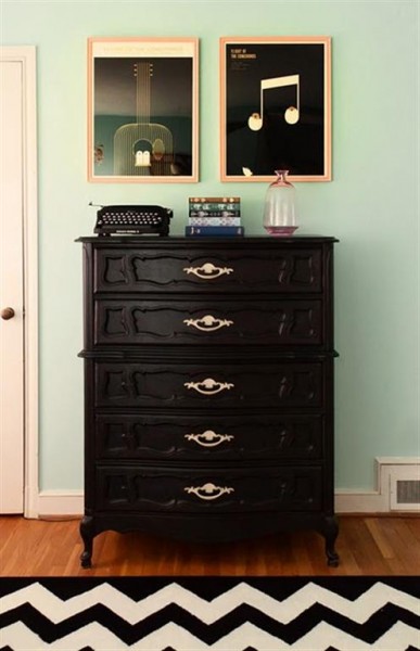
I absolutely love this room . It makes me want to put a black and white chevron rug in every room of our house (half kidding). I love the simplicity of it, the colors, the great lines of all the pieces she chose to use in this nursery.My oldest son is in need of a dresser, and after seeing this one I think we’ll start looking for a tall one.
It’s a great combination of old and young. There are some baby elements here, but really it’s a room to grow into. I think that’s what I like about it so much. These pictures helped me realize why I’ve struggled with pulling together the bedrooms of my children. I need rooms that are both young and old at the same time to accommodate the ages, interests and needs of children of different ages. For example, right now I have three girls in one room, ages 8, 6 and 3. We need to change it, move the eight year old in with her twelve year old sister, and move the baby out of our closet into the room for three.I also have two sons, ages four and ten, who share a room. I need something that works for both of them. My oldest son wants an over-the-top teen room, but his room also doubles as a guest room, so I want something that’s both trendy AND timeless. I want all of their rooms to reflect both where we are now and what we’re quickly growing into.
I’ve also realized that I’d fallen prey to thinking that I couldn’t carry some of my favorite design elements into the kids rooms, partly because I’m not sure they’d like them and largely because I don’t want them to break everything! I’m setting that thinking aside, and I’m going to use the things I love in their bedrooms, but in a way that also reflects who they are and gives them spaces they will feel comfortable in. After all, they’re totally comfortable in my family room, so why not have the whole house look like I want it to?
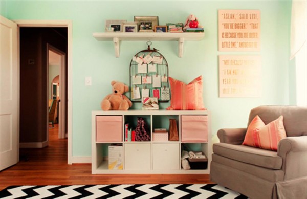
I like the way Vivien’s nursery has some nods to trend, such as the whimsical bird cage card holder, while also having elements that are much more classic, like the mirror and furniture pieces, including the chair. Want to learn more about it? Head over here .
So, here’s my short list of specific things about this nursery that really pull me in:
1. Colors. I’d love to paint a room this color, but really, most of the house is already aqua, so the bedrooms are a break from the blue that is everywhere else. For now I’m going to work with the paint colors we already have and wait to start repainting for a couple more years when we’re out of the writing on wall stage with my little ones.
2. Rugs. I’m going to start using more rugs. And one of them will be a black and white chevron. Yup. I’m totally going to copy. End of discussion.
3. Classic furniture. For now we’re going to work with what we have. I have a couple of pieces I might put new drawer hardware on, but I’m not going to re-paint anything for now. As I look for new pieces, however, I’m going to look for really classic pieces that we can use forever.
4. Mirrors. I’ve been in love with mirrors for several years now. I love the way they bring light into a room. I think it’s time to use more mirrors in the bedrooms.
5. One of my favorite things in the nursery above is the quote from C.S. Lewis’ Chronicles of Narnia. I love words, love books, love good quotes. There’s a lot of artwork out there right now using words and quotes like this, and it’s pretty pricey. I think I’m going to choose a favorite and try my hand at making my own.
6. Lamps. I want to get some great lamps in the bedrooms. It’s a fairly simple way to update things and thanks to stores like Home Goods, it’s easy to find good ones for a great price.
7. No clutter. In this nursery, the only spot that could be labeled as clutter is the shelf above the card holder, and none of that will ever end up on the floor. It looks open and clean, ready to be lived in. Whatever I use to decorate their rooms, it’s going to be things that won’t turn into useless clutter that we just have to clean up… over and over again. Children collect enough clutter on their own.. I’m not going to help them.
Generally speaking, I’m going to use what I have. Until I have really tried all the options I already have in our house (shop the basement) I’m not going to spend a penny. Once I have everything figured out, I’m going to have a yard sale, sell everything that’s left, and then purchase a few items to finish it all off. My goal is to get through things rather quickly so the interior of the house is set and ready before spring. We have a ton of work to do outdoors this spring and summer, and I want to have the house under control before then.
Let me acknowledge here that I understand that having a stylish bedroom is absolutely unessential to a healthy childhood. But I’ve been hanging on to this and that in case I’ll use it someday in one of their rooms, and it’s time to clear out because clearing out WILL contribute to a healthier, simpler family life. So if I’m going to clear out, I might as well do it right. And I might as well have a little bit of fun doing it, right? As I said, I know these things are non-essential but I enjoy them. For better or worse I’ve had a picky eye all my life. I spend a lot of time in this house, and I just feel better if I like where I am.
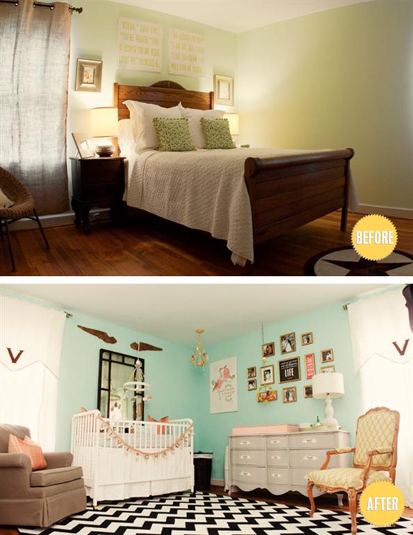
So here is one last look at my inspiration room, the before and after of this gorgeous nursery.
So the work begins.HH


its stunning. I agree. I love that so much is going on with so many colors that covers antique to modern. I love it too! I want one!