Updated Vintage Desk

I’ve mentioned before that I’m working on being a better, faster finisher.
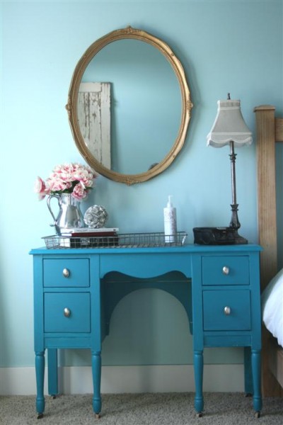

This project earns no points in speed, but it’s done.

I’ve been living without a bedside table for over a year and it wasn’t working.  Taking a cue from this piece on my husband’s side of the bed, I went to work.
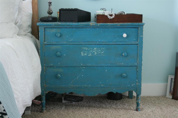

I love the layers of distressed paint on this dresser, as well as the legs and the detail at the bottom.  The drawer runners are in sad condition, which was how I paid only $5 for it at a yard sale last year.  My husband stores very little in it, so it serves it purpose in function as well as adding a pop of color and character to the room.

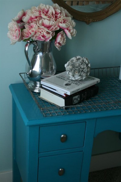
A few years ago I picked up this vintage desk for $7.00.  It didn’t fit in the spot I originally intended to use it, so it’s been sitting in the basement until I found a use for it.
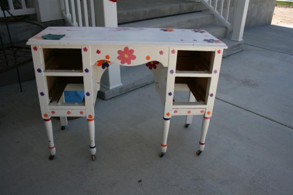

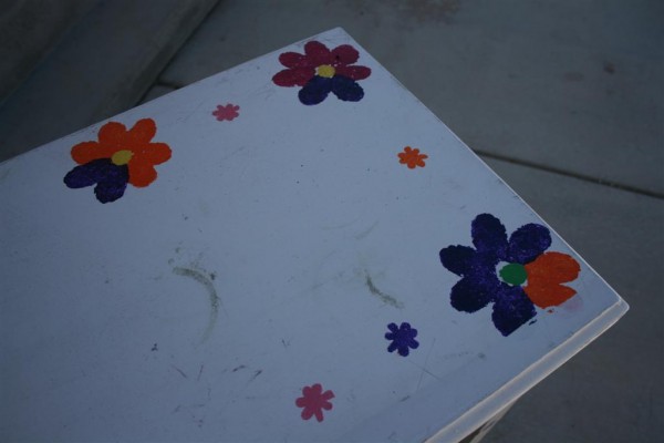
The paint job was quite frightening and took a LOT of sanding to prep for a fresh coat of paint.

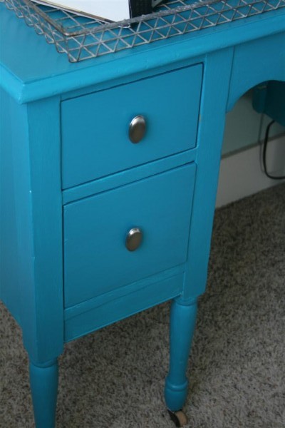
What I loved about it were the legs and the old wooden wheels.
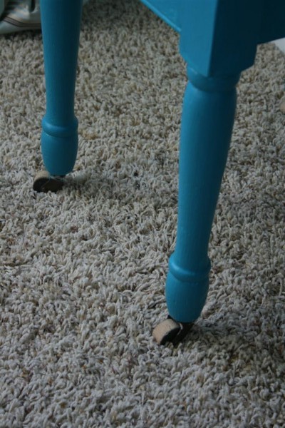

My original intent was to paint the desk, then rough it up and distress it.   When I was done painting, I really liked it as it was.  I skipped the distressing and hauled it upstairs.
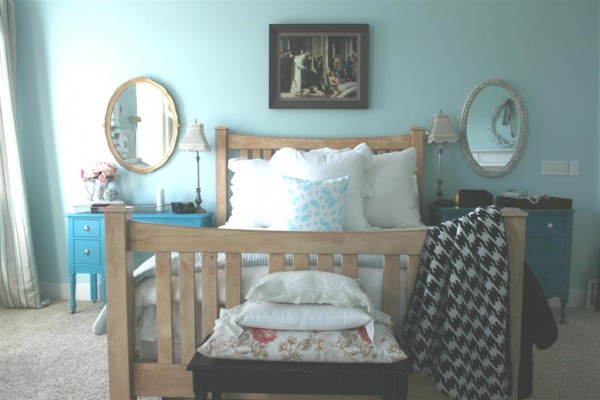

Since the desk sits on the side of the bed near the windows, it gets a lot of light, which further emphasizes the fact that the desk is brighter in color than the dresser.  I was nervous about it, but I actually like it.  The two sides are balanced without being exactly alike.

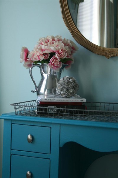
Finishing the desk meant hanging two vintage oval mirrors I’ve had sitting forever.  Over the desk I hung a more feminine, wider, gold mirror.  I picked it up for $5 at a yard sale last year in Colorado.  Over the dresser I hung a mirror purchased at a thrift store.  I thought it was dirty but when I cleaned it I discovered that someone had created this gold and white finish with paint.  While my original plan was to paint one of the mirrors, I liked both finishes and opted to leave them alone, letting the oval shape tie them together without matching finishes.
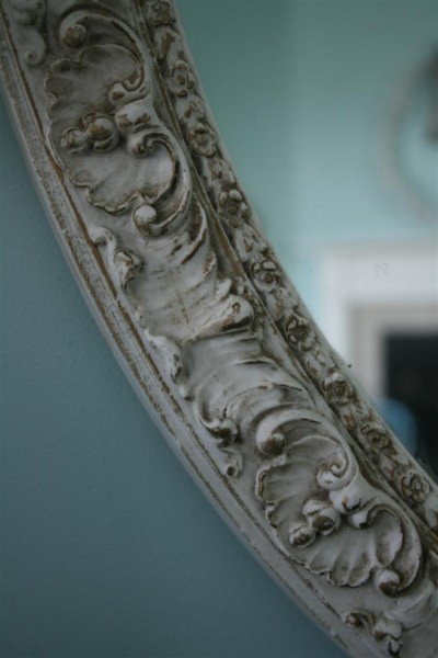
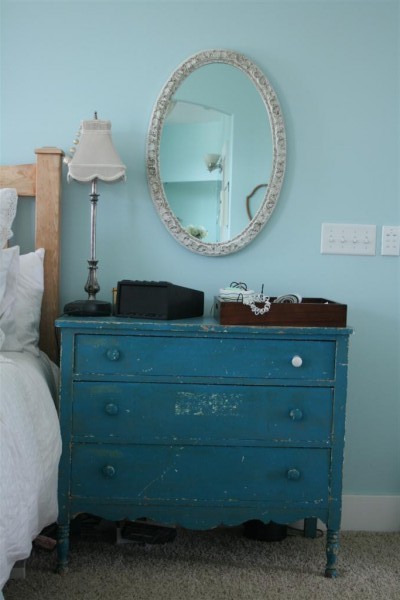


And so, two projects are now done.  The mirrors are hung as I pictured and the desk is now in use as a bedside table.  The painting spot in my basement is available for a new project (of which I have an abundance waiting).  I’ve loved having a place for my lamp, alarm clock, and current reading.  I also love the way this vintage wire basket looks atop the desk.

One last look.  Before:


After:
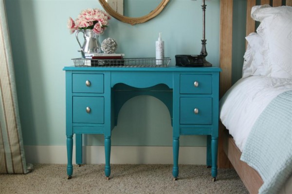

Quite an improvement, wouldn’t you agree?

Hopeful Homemaker project shared here and here

Mirrored Dresser

As a result of this post I want to look for a taller dresser for my son’s room.


In the past week or so I’ve started thinking about a mirrored one.

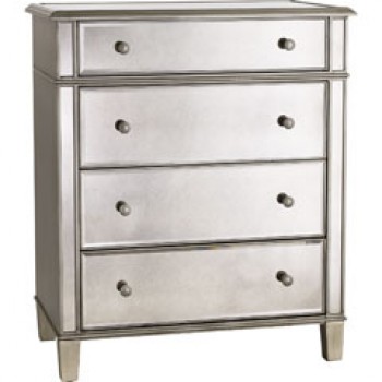
This piece
from Pier 1 might be an option.  I really want one that has five drawers, though, and is a little taller.

I know that I would love to have a mirrored dresser in this room (remember it doubles as a guest room sometimes, so I want classic style as well as teenage boy in there).  The question is, what would a teenage boy think of it?  And would he break it?  (think lacrosse balls…)

Realistically, if I can find something used I’ll do that first.  We’ve got a half dozen or more items above this purchase on our priority list.  We’ll see what happens.  His birthday is early in June and I would really like to have his room looking great before that.  He’s had a tough year.

On a similar note, I had a few minutes to spare while waiting in the car recently, and I sketched out plans for all the bedrooms I’m trying to pull together for my kiddos.  It was a lot of fun.  I sketched them in the notebook I keep in my purse and it’s been helpful to have it done.  When I’ve had new ideas I’ve been able to add them, and when I ‘ve seen things that I like it’s been easy to glance at the sketches, decide if it’s what I really want, close the notebook, and move on.  I feel like having that plan in drawing form is helping me make good financial decisions and keep my eye on the money I’m saving for what I really want.  I guess I’m learning some of the benefits of having the design sketched out.  No wonder all the professionals do it!

I hope your weekend is wonderful.
Jennifer

Stunning Living Room

Okay, so I don’t very often look at pictures and say to myself, “That’s it.  That’s the room I want.”

But I did when I saw these pictures.


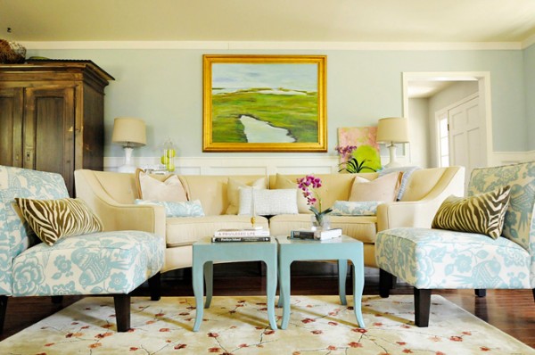
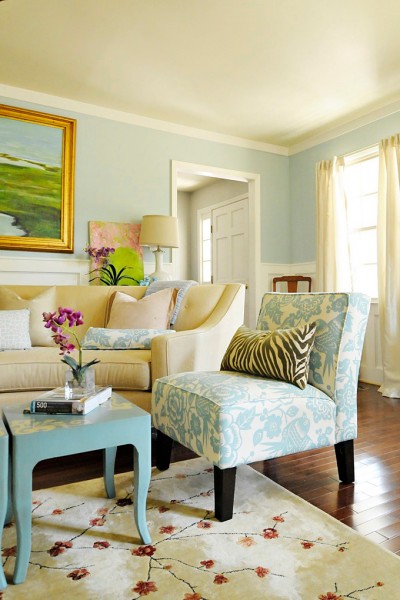
Wow.  I love this room.  It’s done in my colors!  The ONLY thing I would change would be to swap in the rug from this room.


I love that this room was created by the homeowner, and photographed by her as well.  Somehow I like rooms better when they’re created by the people who live in them.  I love the work of designers, too, but I always wonder if people really live in those spaces.  You can find Julia’s blog here .  The room was featured on House of Turquoise , which is where I saw it.


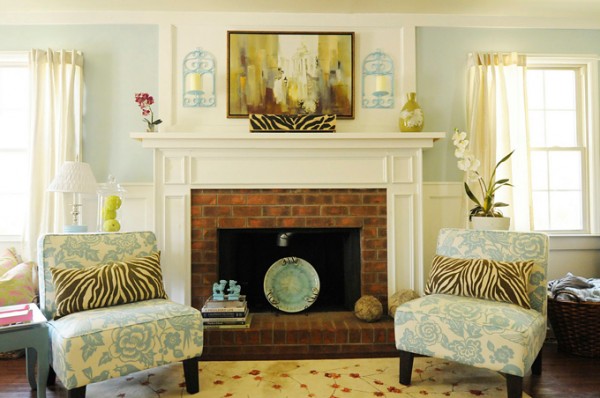
My favorite elements in the room, aside from the all the blue and white on the walls, are the chairs and the painting.  Julia painted that gorgeous piece.  And while I’m not usually a fan of gold, I’d hang that beauty in my house in a heartbeat.  Stunning.


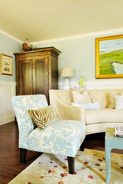
The chairs are on my wish list.  I’ve loved this aviary print for a long time.  Chances are I’ll never see them in person because they’re low on the priority list, but still they’re beautiful.  I was surprised by this, but I actually like the zerbra print pillows.  I’ve NEVER like animal prints, but these pair really well with the chairs and add a nice touch to the room.  Once again, there’s not too much clutter in the room so it’s easy on the eye.

It’s all so beautiful.  I suppose it’s a good thing that my living room doesn’t look like this.  I’d never leave it, which would be a very sad thing for our bathrooms.   Truthfully, I don’t share these pictures because I’m unhappy with my own house or because I’m wishing mine was like this.  My floor plan is different, and our family’s needs are different.  My home is full of children running and bumping and spilling.  I refuse to let the house be more important than the people, so I do some things my own way in order to reduce stress.  For instance, I could never put an orchid on a coffee table.  It would be spilled, broken, eaten by someone before I could take a single picture (remember George?) .  And that’s life.

I share them because lately I’ve been really motivated by pictures like these.  They’re helping me decide what I want to do with my own house, and I’m taking those ideas and putting them to work with items I already own.  It’s a really fun creative experience for me, and I feel urgent about doing it before the warm season pulls us outdoors.   The before and after pictures of this particular room are also a great reminder that a good eye and paint can go a long way.

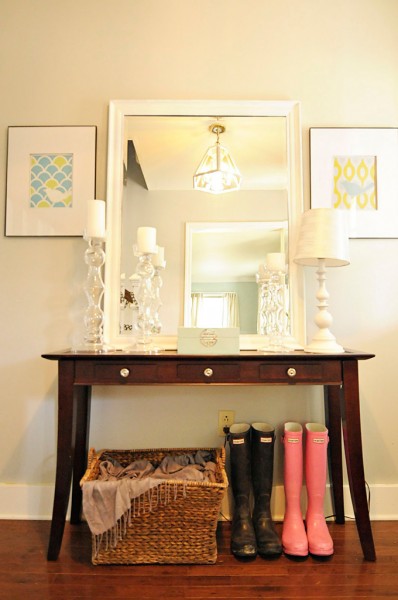
Lastly, here is her entry.  We don’t have an entry in our house, or at least we don’t have a wall in the entry for the eye to rest on.  Ours opens up to three rooms and a hallway.  I really like the way she’s made this entry both beautiful and functional.  That basket beneath the console table holds her scarves.  What a great idea.  I also like the bird print to the left of the mirror.


It’s always fun to see the creativity and vision that people have.  I love it.  Now I’m off to hang a piece in the girls’ room .  I want to get it finished and move on to the boys’ room ASAP.

All photos in this post are from Pawley’s Island Posh via House of Turquoise.
Hope your day is great!
Hopeful Homemaker

1 8 9 10 11 12 24