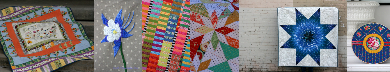
Prosper Quilt Blocks
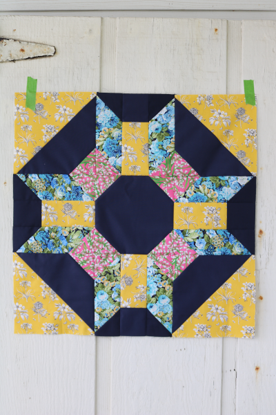
I dove into my Prosper quilt pattern last week in preparation for a class I taught at The Quilted Beehive in Ogden UT. We had a great time sewing with gorgeous fabrics in a lovely space. For my class samples I leaned into some big juicy florals, mostly from Free Spirit Fabrics. Specifically, the Celebration of Sanderson prints which I’ve been hanging onto. And wow, these Prosper quilt blocks are showing off!
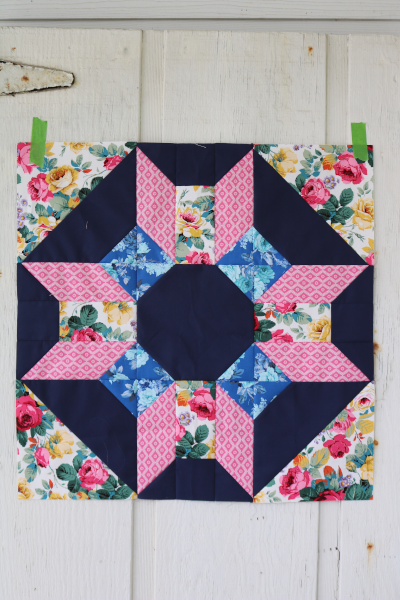
I selected a deep navy blue as my background color, which highlights the florals perfectly. It makes them even brighter and I love it. I have made this quilt with a white background , and also with prints for the background here and here , but never with a dark solid. This is the same deep blue I used in my Show Up quilt top. It’s an Art Gallery solid, called Nocturnal, and is definitely my current favorite.
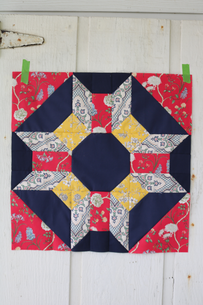
Consistent with my style, I pulled a few prints from other designers into the mix, such as the Brigitte Giblin print above (navy and white) and the green floral by Windham below. The purple is a Riley Blake print. It’s nice to mix designers for a combination that’s unique.
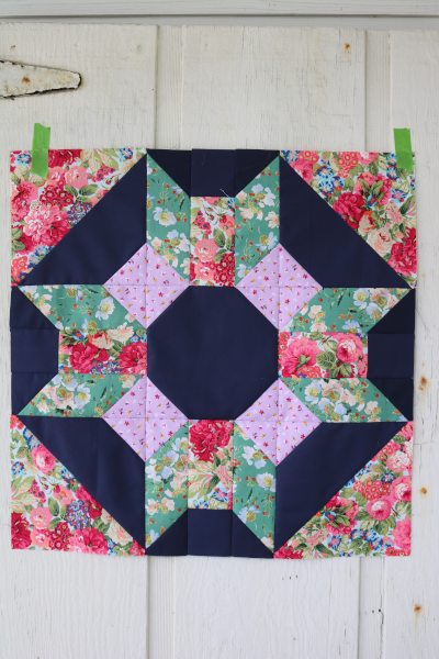
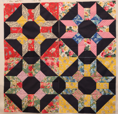
Having made a few blocks, I’m now in the groove so the cutting and sewing feels natural and all the measurements are in my head. My goal is to make one block each day and finish this quilt top by the end of the week. It’s going to be a 9 block version instead of 12, like this one I did in solids long ago. The blocks are large, finishing at 22.5, and each one is its own beautiful composition.
Taking indoor photos means terrible lighting, but I snapped this photo of all four prosper quilt blocks on my design wall anyway. I love the way the navy background looks in these blocks. Another reason to finish right away!
I hope you’re working on something fun today!
Jennifer