Little Girls’ Room Done!
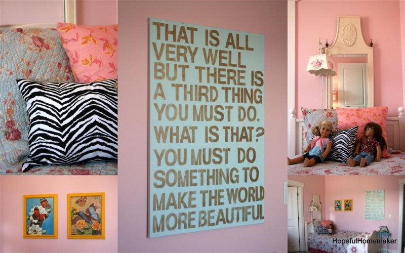
My little decorating project is complete. The yellow chevron pillow I made for one bed a couple of months ago turned out to be the inspiration for adding a bright yellow throughout the room as an accent color. DIY projects pulled the room together with only a few dollars spent on paint. Among them was the above canvas with a quote from a favorite children’s picture book, Miss Rumphius. I painted some frames I already had a bright yellow and my six year old chose some vintage butterfly prints to hang in them. A zebra stripe pillow and her side of the room was taken care of.
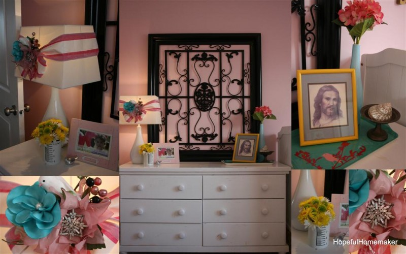
The dresser is now the focal point of the room. I found this huge metal piece on clearance at a local shop and brought it home. A few coats of black paint and it was ready. I originally intended to cover the lamp shade in a yellow and white fabric, but at the last minute I chose to tie a length of ribbon around it. I added a vintage millinery flower and pinned a vintage broach in the center of it. (Hooray for me! Too often I save these vintage pieces of jewelry for “something special” which really means they sit in a drawer. This one was used immediately.) I also added a turquoise flower and a bird. Once more I painted an old frame yellow, then shopped my house for the bird tray and some accessories. We’ll see how they do at keeping it clean. Most of the accessories will go if it turns into meaningless clutter.
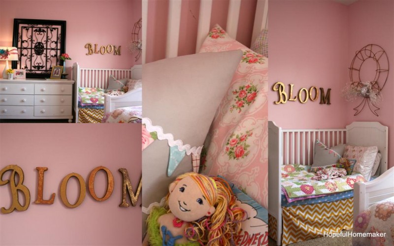
Above the crib I hung letters that spell “bloom.” I’ve had them for a few years and I’m happy they’ve found a permanent home. I’m still in love with that chevron crib skirt as well. It’s a happy little corner.
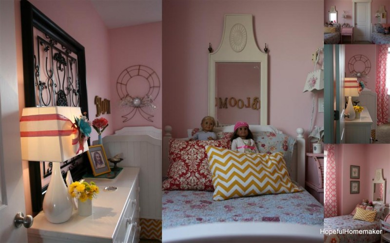
I love the collection of vintage pieces I’ve used in this room: the mirrors over the beds, my vintage metal wreath above the crib, the miniature pink roll-top desk, vintage grandmother’s garden quilts, butterfly prints and the rose prints in gold frames. I also love the modern pattern and colors that come with the fabrics: yellow chevron in the crib skirt and pillow, black zebra on a pillow, pink and white lattice print on the curtains. It’s got that mix of old and new that I’m drawn to. The art canvas adds a deeply personal touch to the space with a quote that’s very special to one daughter. This room is a labor of love. I love my girls, and we all love the room. Let’s hope they keep it clean!
Hopeful Homemaker

