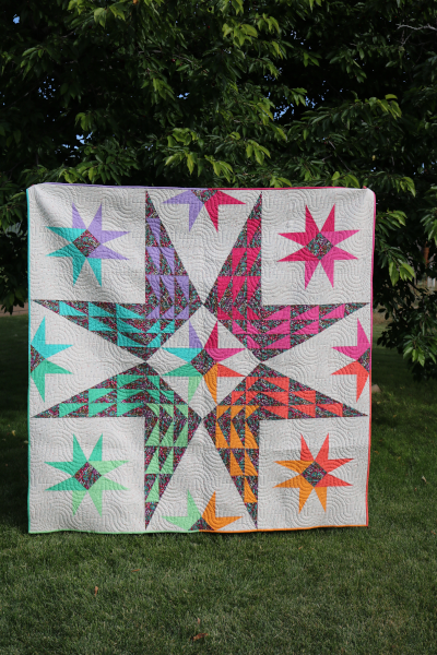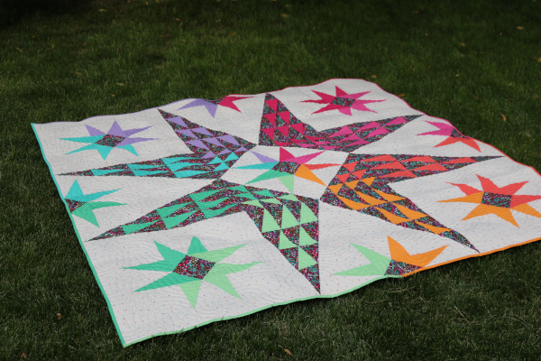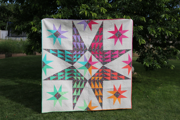
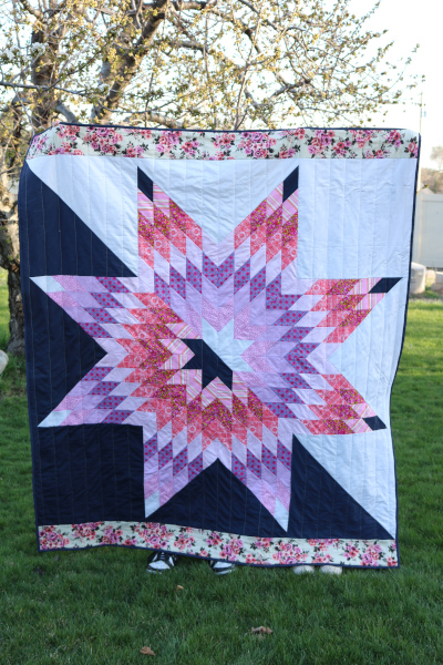
Hope: A Lone Star quilt
Earlier this year I was involved in a quilt swap with several amazing women. Each of us was assigned a name, given a few color and style preferences, and we had several months to make them a quilt. No pressure! Actually, I felt so much pressure. Over time, I noticed that most of my conversations with my assigned friend touched on the topic of hope. In some way, it seemed to come up again and again. This led me to my chosen design: Hope, a lone star quilt.
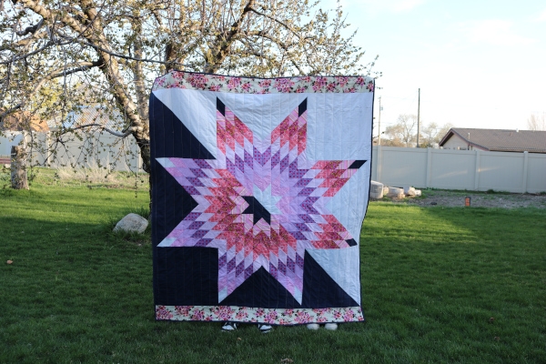
Sometimes the darkness presses in from the outside, and sometimes it comes from within. I wanted to communicate both. But I also wanted to show that light always rises to meet it, chasing darkness away.
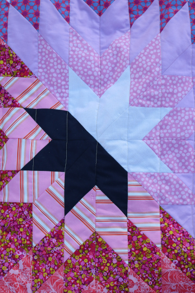
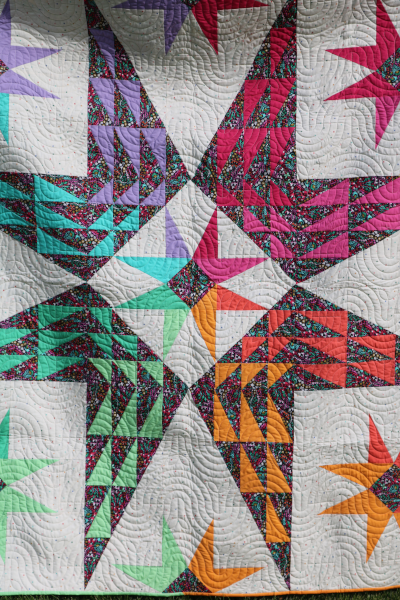
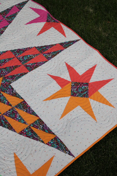
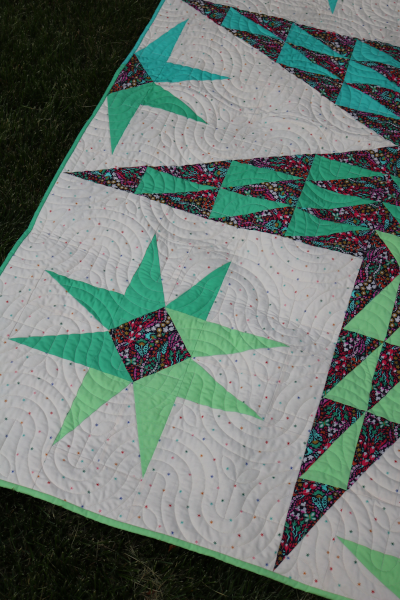
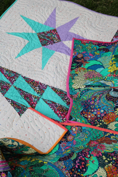
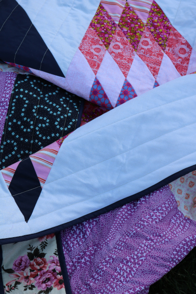
So I pursued an idea I’ve dabbled with a lot, flipping half a lone star the other direction. I used my Mod Lone Star pattern and placed the color change on the diagonal instead of top and bottom, just because. (I’ve actually done this before and prefer the diagonal line.) In my quilt, the deep navy blue represents the darkest night, and the white is actually a white metallic fabric with a gorgeous shimmer to it. I wanted to give the light “more” than the dark. Metallic was the way to go.
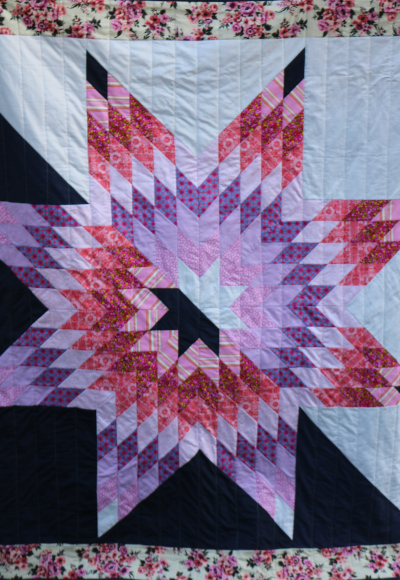
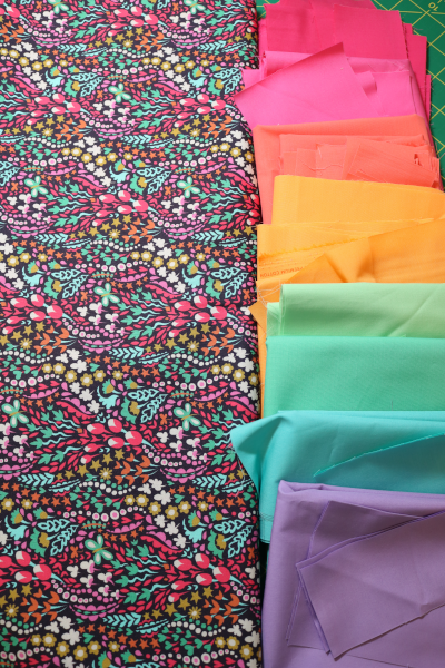
The other colors – pinks and lilacs – are pulled from my friend’s list of preferred colors. And the top/bottom borders are scraps from the back of My Heart, Today . I knew that she’s a huge fan of the Outback Wife prints and these scraps were a perfect way to honor that.
Hope, a lone star quilt is my effort to share a little hope through a quilt. To offer a reminder that we always have hope, especially if we look in the right places to find it. And we can also offer hope to others when they are in their dark nights. Just like my Morn Shall Tearless Be quilt , I hoped to give a reminder that eventually the light shines again and we smile for real. Hopefully we find ways to do it every day, even as we struggle.
Our world struggles with hope, I think. Uncertainty abounds and life often seems off-center. We need hope for the big AND little things, for our trials and everyday. I enjoy exploring these thoughts as I sew. It reminds me to focus on the good, to look for the light. I have hope for a bright future.
I hope you do, too! Thanks for visiting!